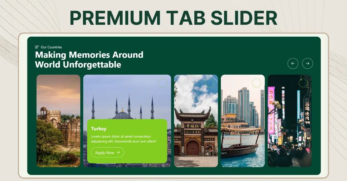
Premium Tab Slider
Tabs and Sliders are essential for creating engaging and intuitive interfaces. At Weboxy Technology, we’ve taken these tools to the next level with the Premium Tab Slider—a dual-purpose solution designed for seamless user interaction and stunning visuals.
Here are the top differences in the table below:
| Features | Tabs | Sliders |
| Purpose | Organize and group content into sections | Showcase multiple items in a Sequential manner |
| Navigation Style | Click-Based, users select specific tabs | Scroll-Based, users swipe or click arrows |
| User Experience | Allows Quick access | Focuses on Gradual Exploration |
| Content Visibility | Displays multiple categories upfront. | Shows one item at a time. |
| Responsiveness | Adjusts easily to different screen sizes. | May require additional optimization for mobile. |
That’s why we offer a versatile new tab slider, designed to meet multiple needs and enhance user experience. For more insights on using tabs and sliders effectively in web design, visit the Interaction Design Foundation.
Why Choose the Premium Tab Slider?
In the modern digital age, user experience is king. The Premium Tab Slider isn’t just a regular component; it’s a powerhouse of functionality combined with a visually striking design. Here’s why it stands out:
Key Features
- Dynamic Dual Functionality
- Use it as a tab navigation system for smooth switching between content.
- Transform it into a slider for showcasing products, images, or blog posts.
- Plagiarism-Free, Unique Design
Every element, from animations to transitions, is tailored with originality, reflecting the standard of excellence. - Customizable for Any Use Case
Whether you’re building a travel website, an e-commerce platform, or an educational portal, this slider is adaptable to all industries. - Lightweight and Responsive
Designed with React and optimized for performance, the slider works flawlessly across devices.
How Does It Work?
The Premium Tab Slider is powered by React and offers an intuitive API for customization. Its clean codebase ensures that developers can easily integrate it into their projects.
Application Ideas
- Travel Blogs: Showcase destinations with stunning imagery and short descriptions.
- Product Catalogs: Highlight the features of your top products.
- Educational Content: Allow users to navigate between courses or topics effortlessly.
- Portfolio Websites: Create an interactive display of your work and achievements.
Premium Tab Slider – Html Code
<!DOCTYPE html>
<html lang="en">

<head>
  <meta charset="UTF-8" />
  <meta name="viewport" content="width=device-width, initial-scale=1.0" />
  <title>Dynamic Tabs Slider with Animations</title>
  <style>
    /* General Container */
    body {
      background: #f1f5eb;
    }

    .tabs-container {
      background-color: #034833;
      padding: 2%;
      width: 94%;
      margin: auto;
      border-radius: 20px;
      color: white;
      font-family: Arial, sans-serif;
    }

    /* Navigation Buttons */
    .tabs-nav {
      display: inline-flex;
      gap: 20px;
      padding: 0 4% 0 0;
    }

    .nav-btn {
      background-color: transparent;
      color: white;
      width: 44px;
      height: 44px;
      border: 1px solid white;
      cursor: pointer;

      border-radius: 50px;
    }

    .nav-btn>svg {
      width: 16px;
      height: 16px;
    }

    .nav-btn:hover {
      background-color: #83cd20;
      border: none;
    }

    /* Tabs Wrapper */
    .tabs-wrapper {
      display: flex;
      justify-content: center;
      height: 100%;
      padding: 0 2%;
      overflow: hidden;
    }

    .tabs {
      display: flex;
      width: 100%;
      gap: 10px;
    }

    .tab {
      flex: 0 calc(20% - 10px);
      height: 380px;
      color: #333;
      border-radius: 20px;
      overflow: hidden;
      display: flex;
      width: 20%;
      align-items: center;
      justify-content: center;
      cursor: pointer;
      text-align: center;
      transition: all 0.4s ease;
      font-weight: bold;
      position: relative;
    }

    .tab-header {
      font-size: 1rem;
      width: 100%;
      display: flex;
      padding: 12px;
      justify-content: end;
    }

    .tab-content {
      display: none;
      flex-direction: column;
      text-align: left;
      background-color: #83cd20;
      border-radius: 18px;
      padding: 22px;
      opacity: 0;
      font-size: 0.9rem;
      margin-bottom: 10px;
      transition: all 0.3s ease-in-out;
    }

    .tab-content>p {
      font-weight: 400;
    }

    /* Active Tab State */
    .tab.active {
      flex: 0 0 calc(40% - 10px);
      /* Double width for active tab */
      color: white;
    }

    .tab.active .tab-content {
      display: block;
      opacity: 1;
      transform: translateY(0);
    }

    .circle {
      width: 36px;
      height: 36px;
      border-radius: 55%;
      display: flex;
      align-items: end;
      border: 1px solid #83cd20;
    }

    .content-wrap {
      color: #ffffff;
      padding: 20px 20px;
      display: flex;
      justify-content: space-between;
      flex-direction: column;
      width: 100%;
      height: 100%;
    }

    .tab-btn {
      display: flex;
      justify-content: center;
      align-items: center;
      gap: 12px;
      padding: 11px 15px;
      color: white;
      border: 1px solid white;
      margin-bottom: 10px;
      border-radius: 66px;
      background-color: transparent;
      outline: none;
    }

    .tab-header {
      display: flex;
      align-items: end;
      padding-bottom: 40px;
      width: 100%;
      justify-content: space-between;
    }

    .headings>p {
      font-size: 11px;
      display: inline-flex;
      justify-content: center;
      gap: 4px;
      align-items: center;
    }

    .headings>h2 {
      font-size: 2.3rem;
      line-height: normal;
      width: 60%;
      margin: 0px;
    }

    .tab-head {
      width: 100%;
      display: flex;
      justify-content: end;
      padding-top: 20px;
    }

    .prev {
      transform: rotate(180deg);
    }

    /* responsive */

    @media (max-width: 1024px) {
      .tab {
        flex: 0 calc(33.33% - 10px);
        /* Adjust for tablets */
      }
    }

    @media (max-width: 768px) {
      .tab {
        flex: 100%;
        width: 100%;
        margin-bottom: 2px;
        /* Adjust for small screens */
      }

      .tab-header {
        display: flex;
        flex-direction: column;
        gap: 20px;
        justify-content: left;
        align-items: start;
        padding-bottom: 30px;
      }

      .tabs {
        display: flex;
        flex-direction: column;
        width: 100%;
        gap: 18px;
      }

      .tabs-nav {
        display: none;
      }

      .headings>h2 {
        width: 100%;
      }
    }

    @media (max-width: 480px) {
      .tab {
        flex: 0 calc(100% - 10px);
        /* Adjust for mobile */
        height: auto;
      }

      .content-wrap {
        padding: 12px;
      }

      .tab-content {
        font-size: 0.8rem;
        /* Adjust font size for smaller screens */
      }
    }

    @media (max-width: 768px) {
      .tabs-container {
        padding: 10px;
      }

      .circle {
        margin-bottom: 14px;
      }

      .tab-content h1 {
        font-size: 1.2rem;
      }
    }

    @media (max-width: 480px) {
      .tabs-wrapper {
        overflow-x: auto;
      }

      .tabs {
        gap: 5px;
        /* Reduce gap between tabs */
      }
    }
  </style>
</head>

<body>
  <div class="tabs-container">
    <!-- Navigation Buttons -->
    <div class="tab-header">
      <div class="headings">
        <p>
          <img width="14px"
            src="https://cdn.prod.website-files.com/670a865d1b09b4d35711a2e5/6730e960ac02ab42b89274be_ico2.svg"
            alt="" />
          Our Contries
        </p>
        <h2>Making Memories Around World Unforgettable</h2>
      </div>
      <div class="tabs-nav">
        <button class="nav-btn prev">
          <svg xmlns="http://www.w3.org/2000/svg" width="19" height="19" viewBox="0 0 24 24" fill="none" app="ikonik"
            class="ikonik-y5sm9f">
            <path d="M3 12H21M21 12L14 5M21 12L14 19" stroke="currentColor" stroke-width="2" stroke-linecap="round"
              stroke-linejoin="round" app="ikonik" class="path-fyvl8"></path>
          </svg>
        </button>
        <button class="nav-btn next">
          <svg xmlns="http://www.w3.org/2000/svg" width="19" height="19" viewBox="0 0 24 24" fill="none" app="ikonik"
            class="ikonik-y5sm9f">
            <path d="M3 12H21M21 12L14 5M21 12L14 19" stroke="currentColor" stroke-width="2" stroke-linecap="round"
              stroke-linejoin="round" app="ikonik" class="path-fyvl8"></path>
          </svg>
        </button>
      </div>
    </div>

    <!-- Tabs Wrapper -->
    <div class="tabs-wrapper">
      <div class="tabs">
        <div class="tab" style="
              background: url(https://cdn.prod.website-files.com/670a865d1b09b4d35711a2e5/6762f9363c715bf75c73300c_castle-3750875_1280.jpg);
              background-size: cover;
              background-position: center;
            ">
          <div class="content-wrap">
            <div class="tab-head">
              <div class="circle"></div>
            </div>
            <div class="tab-content">
              <h1>Pakistan</h1>
              <p>
                Lorem ipsum dolor sit amet consectetur adipisicing elit.
                Assumenda eum iure ullam!
              </p>
              <button class="tab-btn">
                Apply Now
                <svg xmlns="http://www.w3.org/2000/svg" width="19" height="19" viewBox="0 0 24 24" fill="none"
                  app="ikonik" class="ikonik-y5sm9f">
                  <path d="M3 12H21M21 12L14 5M21 12L14 19" stroke="currentColor" stroke-width="2"
                    stroke-linecap="round" stroke-linejoin="round" app="ikonik" class="path-fyvl8"></path>
                </svg>
              </button>
            </div>
          </div>
        </div>

        <div class="tab" style="
              background: url(https://cdn.pixabay.com/photo/2018/03/01/08/21/architecture-3190037_1280.jpg);
              background-size: cover;
              background-position: center;
            ">
          <div class="content-wrap">
            <div class="tab-head">
              <div class="circle"></div>
            </div>
            <div class="tab-content">
              <h1>Turkey</h1>
              <p>
                Lorem ipsum dolor sit amet consectetur adipisicing elit.
                Assumenda eum iure ullam!
              </p>
              <button class="tab-btn">
                Apply Now
                <svg xmlns="http://www.w3.org/2000/svg" width="19" height="19" viewBox="0 0 24 24" fill="none"
                  app="ikonik" class="ikonik-y5sm9f">
                  <path d="M3 12H21M21 12L14 5M21 12L14 19" stroke="currentColor" stroke-width="2"
                    stroke-linecap="round" stroke-linejoin="round" app="ikonik" class="path-fyvl8"></path>
                </svg>
              </button>
            </div>
          </div>
        </div>

        <div class="tab" style="
              background: url(https://cdn.pixabay.com/photo/2021/11/25/15/28/temple-6823939_1280.jpg);
              background-size: cover;
              background-position: center;
            ">
          <div class="content-wrap">
            <div class="tab-head">
              <div class="circle"></div>
            </div>
            <div class="tab-content">
              <h1>China</h1>
              <p>
                Lorem ipsum dolor sit amet consectetur adipisicing elit.
                Assumenda eum iure ullam!
              </p>
              <button class="tab-btn">
                Apply Now
                <svg xmlns="http://www.w3.org/2000/svg" width="19" height="19" viewBox="0 0 24 24" fill="none"
                  app="ikonik" class="ikonik-y5sm9f">
                  <path d="M3 12H21M21 12L14 5M21 12L14 19" stroke="currentColor" stroke-width="2"
                    stroke-linecap="round" stroke-linejoin="round" app="ikonik" class="path-fyvl8"></path>
                </svg>
              </button>
            </div>
          </div>
        </div>

        <div class="tab" style="
              background: url(https://cdn.pixabay.com/photo/2019/03/09/21/30/downtown-4045035_1280.jpg);
              background-size: cover;
            ">
          <div class="content-wrap">
            <div class="tab-head">
              <div class="circle"></div>
            </div>
            <div class="tab-content">
              <h1>UAE</h1>
              <p>
                Lorem ipsum dolor sit amet consectetur adipisicing elit.
                Assumenda eum iure ullam!
              </p>
              <button class="tab-btn">
                Apply Now
                <svg xmlns="http://www.w3.org/2000/svg" width="19" height="19" viewBox="0 0 24 24" fill="none"
                  app="ikonik" class="ikonik-y5sm9f">
                  <path d="M3 12H21M21 12L14 5M21 12L14 19" stroke="currentColor" stroke-width="2"
                    stroke-linecap="round" stroke-linejoin="round" app="ikonik" class="path-fyvl8"></path>
                </svg>
              </button>
            </div>
          </div>
        </div>

        <div class="tab" style="
              background: url(https://cdn.pixabay.com/photo/2020/01/31/07/10/city-4807268_1280.jpg);
              background-size: cover;
              position: relative;
            ">
          <div class="content-wrap">
            <div class="tab-head">
              <div class="circle"></div>
            </div>
            <div class="tab-content">
              <h1>Japan</h1>
              <p>
                Lorem ipsum dolor sit amet consectetur adipisicing elit.
                Assumenda eum iure ullam!
              </p>
              <button class="tab-btn">
                Apply Now
                <svg xmlns="http://www.w3.org/2000/svg" width="19" height="19" viewBox="0 0 24 24" fill="none"
                  app="ikonik" class="ikonik-y5sm9f">
                  <path d="M3 12H21M21 12L14 5M21 12L14 19" stroke="currentColor" stroke-width="2"
                    stroke-linecap="round" stroke-linejoin="round" app="ikonik" class="path-fyvl8"></path>
                </svg>
              </button>
            </div>
          </div>
        </div>
      </div>
    </div>
  </div>

  <script>
    const tabs = document.querySelectorAll(".tab");
    const nextBtn = document.querySelector(".next");
    const prevBtn = document.querySelector(".prev");

    let currentIndex = 1; // Initialize with the 2nd tab active
    const totalTabs = tabs.length;

    // Function to Update Tabs
    function updateTabs(indexToActivate) {
      tabs.forEach((tab, index) => {
        // Remove active state for all tabs
        tab.classList.remove("active");

        // Add active state for the clicked or navigated tab
        if (index === indexToActivate) {
          tab.classList.add("active");
        }
      });
    }

    // Navigation: Move to Next Tab
    nextBtn.addEventListener("click", () => {
      currentIndex = (currentIndex + 1) % totalTabs; // Loop back to start
      updateTabs(currentIndex);
    });

    // Navigation: Move to Previous Tab
    prevBtn.addEventListener("click", () => {
      currentIndex = (currentIndex - 1 + totalTabs) % totalTabs; // Loop to end
      updateTabs(currentIndex);
    });

    // Add Click Event Listeners to Tabs
    tabs.forEach((tab, index) => {
      tab.addEventListener("click", () => {
        currentIndex = index; // Update current index
        updateTabs(currentIndex);
      });
    });

    // Initialize Tabs
    updateTabs(currentIndex);
  </script>
</body>
</html>
Premium Tab Slider – React Code
import React, { useState } from "react";
const Tabslider = () => {
  const [currentIndex, setCurrentIndex] = useState(1); // Initialize with the second tab active

  const tabs = [
    {
      id: 1,
      title: "Pakistan",
      description: "Lorem ipsum dolor sit amet consectetur adipisicing elit. Assumenda eum iure ullam!",
      background: "https://cdn.prod.website-files.com/670a865d1b09b4d35711a2e5/6762f9363c715bf75c73300c_castle-3750875_1280.jpg",
    },
    {
      id: 2,
      title: "Turkey",
      description: "Lorem ipsum dolor sit amet consectetur adipisicing elit. Assumenda eum iure ullam!",
      background: "https://cdn.pixabay.com/photo/2018/03/01/08/21/architecture-3190037_1280.jpg",
    },
    {
      id: 3,
      title: "China",
      description: "Lorem ipsum dolor sit amet consectetur adipisicing elit. Assumenda eum iure ullam!",
      background: "https://cdn.pixabay.com/photo/2021/11/25/15/28/temple-6823939_1280.jpg",
    },
    {
      id: 4,
      title: "UAE",
      description: "Lorem ipsum dolor sit amet consectetur adipisicing elit. Assumenda eum iure ullam!",
      background: "https://cdn.pixabay.com/photo/2019/03/09/21/30/downtown-4045035_1280.jpg",
    },
    {
      id: 5,
      title: "Japan",
      description: "Lorem ipsum dolor sit amet consectetur adipisicing elit. Assumenda eum iure ullam!",
      background: "https://cdn.pixabay.com/photo/2020/01/31/07/10/city-4807268_1280.jpg",
    },
  ];

  const updateTabs = (index) => {
    setCurrentIndex(index);
  };

  return (
    <div className="bg-[#f1f5eb] min-h-screen flex items-center justify-center">
      <div className="bg-[#034833] md:p-8 p-4 rounded-2xl w-[94%] mx-auto text-white">
        {/* Header */}
        <div className="md:flex  flex-col md:flex-row justify-between items-end mb-6">
          <div>
            <p className="flex items-center gap-2 text-sm">
              <img
                src="https://cdn.prod.website-files.com/670a865d1b09b4d35711a2e5/6730e960ac02ab42b89274be_ico2.svg"
                alt="Icon"
                className="w-4"
              />
              Our Countries
            </p>
            <h2 className="text-2xl md:text-4xl md:w-[66%] w-full font-bold">Making Memories Around World Unforgettable</h2>
          </div>
          <div className="md:flex  hidden gap-4">
            <button
              onClick={() => updateTabs((currentIndex - 1 + tabs.length) % tabs.length)}
              className="w-11 h-11 flex justify-center items-center border border-white rounded-full hover:bg-[#83cd20] hover:border-none transition"
            >
              <svg
                xmlns="http://www.w3.org/2000/svg"
                className="w-4 h-4 transform rotate-180"
                viewBox="0 0 24 24"
                fill="none"
              >
                <path
                  d="M3 12H21M21 12L14 5M21 12L14 19"
                  stroke="currentColor"
                  strokeWidth="2"
                  strokeLinecap="round"
                  strokeLinejoin="round"
                />
              </svg>
            </button>
            <button
              onClick={() => updateTabs((currentIndex + 1) % tabs.length)}
              className="w-11 h-11 flex justify-center items-center border border-white rounded-full hover:bg-[#83cd20] hover:border-none transition"
            >
              <svg
                xmlns="http://www.w3.org/2000/svg"
                className="w-4 h-4"
                viewBox="0 0 24 24"
                fill="none"
              >
                <path
                  d="M3 12H21M21 12L14 5M21 12L14 19"
                  stroke="currentColor"
                  strokeWidth="2"
                  strokeLinecap="round"
                  strokeLinejoin="round"
                />
              </svg>
            </button>
          </div>
        </div>

        {/* Tabs */}
        <div className="md:flex md:flex-row flex-col overflow-hidden ">
          {tabs.map((tab, index) => (
            <div
              key={tab.id}
              className={`flex-shrink-0  my-3 md:my-0 mx-[6px] ${
                index === currentIndex ? "flex-[2] text-white " : "flex-1 text-gray-800 h-[120px] md:h-[380px]"
              }  rounded-2xl overflow-hidden bg-cover bg-center cursor-pointer transition-all`}
              style={{ backgroundImage: `url(${tab.background})` }}
              onClick={() => updateTabs(index)}
            >
              <div className="flex flex-col justify-between h-full p-4 ">
                <div className="flex justify-end">
                  <div className="w-9 h-9 border border-[#83cd20] rounded-full mb-4"></div>
                </div>
                {index === currentIndex && (
                  <div className="text-left bg-[#83cd20]  rounded-2xl px-4 py-6">
                    <h1 className="text-xl font-bold mb-2">{tab.title}</h1>
                    <p className="text-sm">{tab.description}</p>
                    <button className="flex items-center gap-2 mt-4 py-2 px-4 border border-white rounded-full bg-transparent hover:bg-[#83cd20]">
                      Apply Now
                      <svg
                        xmlns="http://www.w3.org/2000/svg"
                        className="w-4 h-4"
                        viewBox="0 0 24 24"
                        fill="none"
                      >
                        <path
                          d="M3 12H21M21 12L14 5M21 12L14 19"
                          stroke="currentColor"
                          strokeWidth="2"
                          strokeLinecap="round"
                          strokeLinejoin="round"
                        />
                      </svg>
                    </button>
                  </div>
                )}
              </div>
            </div>
          ))}
        </div>
      </div>
    </div>
  );
};

export default Tabslider;
If you’re looking to create more visually striking sliders for free, don’t forget to explore our Premium Sliders Categories. Simply click the bold text to uncover its features and see how it can enhance your project.
Webflow Premium Tab Slider Guide
This video will guide you in creating a premium tab slider in Webflow. Follow the tutorial closely and use the provided snippets below to build your own tab slider with ease!
CSS here for tab slider
 <style>
    .slide {
        flex: 0 calc(20% - 10px) !important; /* Default size */
        transition: all 0.4s ease; /* Smooth animation */
    }

    .slide.active {
        flex: 0 calc(40% - 10px) !important; /* Double width for active tab */
        background-color: #27ae60;
        color: white;
    }

    .slide-content {
        display: none; /* Content hidden by default */
        opacity: 0;
        transform: translateY(-10px);
        transition: opacity 0.3s ease, transform 0.3s ease;
    }

    .slide.active .slide-content {
        display: block; /* Show content when active */
        opacity: 1;
        transform: translateY(0);
    }
</style>
Script here for Premium tab slider
<script>
    const tabs = document.querySelectorAll('.slide');
    const nextBtn = document.querySelector('.next');
    const prevBtn = document.querySelector('.prev');

    let currentIndex = 1; // Initialize with the 2nd tab active
    const totalTabs = tabs.length;

    // Function to Update Tabs
    function updateTabs(indexToActivate) {
        tabs.forEach((tab, index) => {
            // Remove active state for all tabs
            tab.classList.remove('active');

            // Add active state for the clicked or navigated tab
            if (index === indexToActivate) {
                tab.classList.add('active');
            }
        });
    }

    // Navigation: Move to Next Tab
    nextBtn.addEventListener('click', () => {
        currentIndex = (currentIndex + 1) % totalTabs; // Loop back to start
        updateTabs(currentIndex);
    });

    // Navigation: Move to Previous Tab
    prevBtn.addEventListener('click', () => {
        currentIndex = (currentIndex - 1 + totalTabs) % totalTabs; // Loop to end
        updateTabs(currentIndex);
    });

    // Add Click Event Listeners to Tabs
    tabs.forEach((tab, index) => {
        tab.addEventListener('click', () => {
            currentIndex = index; // Update current index
            updateTabs(currentIndex);
        });
    });

    // Initialize Tabs
    updateTabs(currentIndex);
</script>